Control charts are line graphs that can be used to see product deviation at a glance. The fluctuating line part of the chart hovers around a median “control line” that represents a specific quality standard.
The purpose of the control chart is to detect process errors and anomalies and also to model prospective improvements. They are commonly used in industrial manufacturing and process management especially when it comes to continuous improvement.
What Is A Control Chart?
A control chart is a process regulation heuristic used in industrial manufacturing as well as other areas of production in business.
A control chart is typically used for time-series data (also known as continuous data). It’s extremely useful for the following:
- Uncovering the root cause of deviations in production
- Monitoring processes for larger than normal deviation rate
- Assessing whether a process needs to go back to the basics or be improved overall
- Regular low-maintenance production management
Shewhart and Statistical Process Control
Control charts for manufacturing were invented by Walter A. Shewhart in the 1920s. You may have heard of Shewhart in the context of his broader framework, Statistical Process Control (SPC). He also collaborated with Edwards Deming, another key historical figure in the area of industrial product management: Deming was known for inventing Total Quality Management (TQM).
Control charts are more closely associated with Shewhart, and they are also called the device used in Statistical Process Monitoring (SPM).
Establishing Control Limits
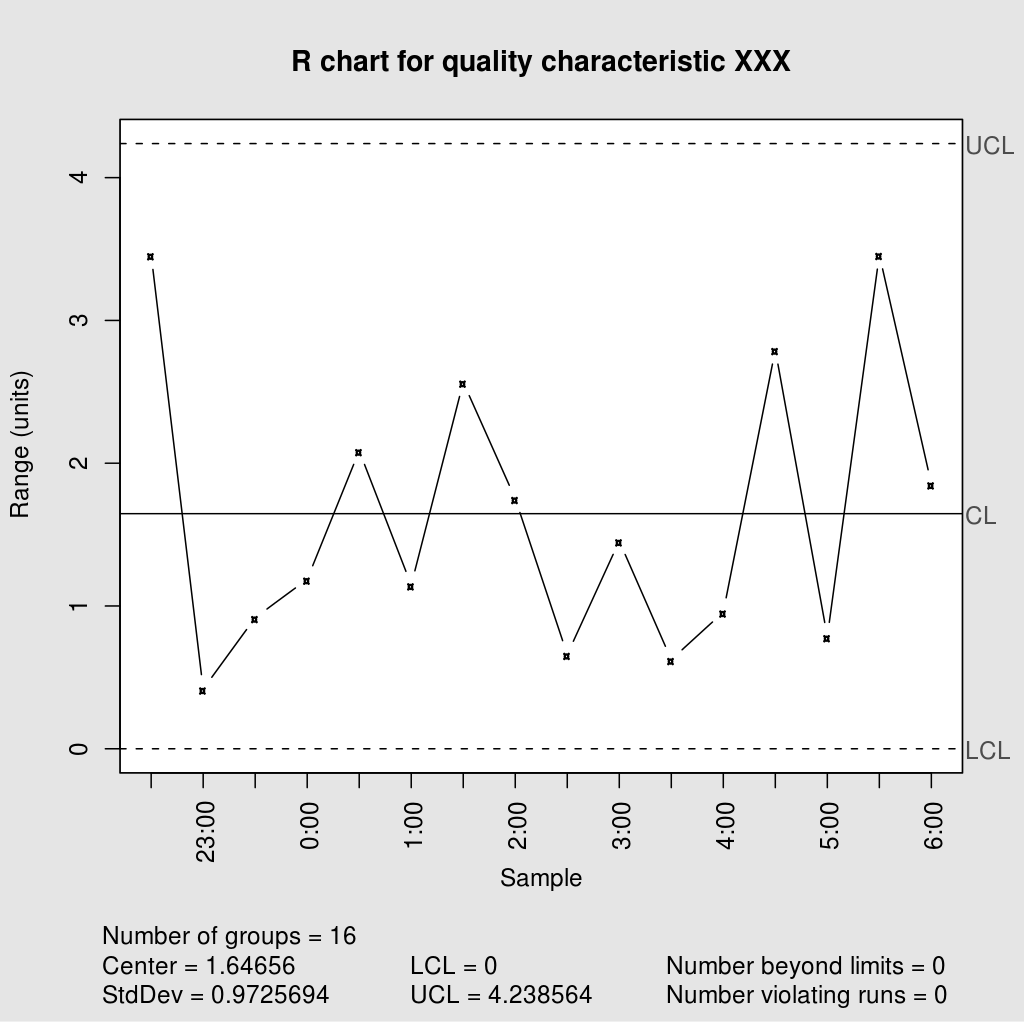
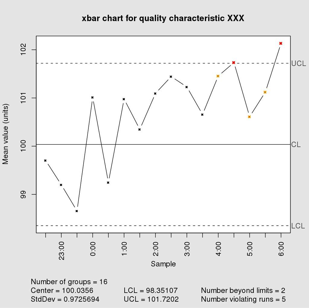
When a production process is under “control,” it means that it is operating normally with understandable, assignable errors. These errors are unavoidable occurrences that otherwise do not compromise the quality of the product. The average standard is represented by the control line in the middle of the graph stretching horizontally from left to right.
There are two other straight horizontal lines in a typical control chart: the Upper control limit (UCL) and lower control limit (LCL), which are above and below the average control line respectively. These lines represent the limits of control, and anything outside of these outer limits represents a non-assignable, or special, variation.
Upper and lower control limits are calculated using standard deviation from the mean.
Prediction Capabilities
Control charts can also be used in your analytical toolbox for predicting future production goals. There’s just one trick: you can only make predictions using processes that are already in a state of control.
If you think about it, it makes a lot of sense: if you were asked to continue drawing a control chart that was already wildly fluctuating, you’d have no reliable information to help you predict what will come next. One guess is just as good as the next.
However, if the control chart showed that the processes were in a state of control (i.e., the fluctuating line was showing normal increments representative of a pattern that stuck closely to the control line), you could make a reliable prediction about upcoming data in that pattern.
This is why control charts are so important for continuous improvement – a properly set up graph can give insights about and beyond the data you feed it.