VKS company logo
VKS company logo

Why VKS

Products

Insights

Company

Blog

Histogram

A histogram is a type of graphical data representation and also one of the seven tools of quality. It represents the distribution of data across a fixed set of increments.

Key Takeaways

  • Tracks data distribution, not data itself

  • One of the 7 tools of quality

  • Useful for identifying product deviations at scale

Unless you’re an analyst you’ve probably skimmed over a couple histograms through the years and thought they were just a fancy type of bar graph. Unfortunately, you couldn’t be more wrong – but don’t worry, we’re going to go through an example and also the reasons why they are unique data representations that fill a niche in your analytical assessments.

Histogram Example

Histograms are a very specific and kind of tricky type of chart, so it’s best to start with an example to really understand why they are useful for data visualization.

Let’s say you sell homemade chocolate chip cookies at the local farmers market. You’re pretty good at eyeballing the amount of dough you should scoop onto the baking tray but you want to see if you are being accurate. After making dozens of cookies per day, it’s possible that you sometimes use less or more than average dough on a cookie here and there, and there are two problems in doing so:

  1. Size variation for the customer (customers will pick through the batch to get the biggest one, and customers who receive a smaller than average cookie may feel cheated)
  2. Cost variation for ingredients (if you routinely over-scoop your cookie dough, you may end up using more ingredients and ultimately, a lower ROI per cookie)

To set up your data collection, you have several increments, or “buckets” you will sort individual cookie measurements into. The number of buckets you choose is up to you, just remember that they will sit along the x-axis of your histogram chart.

Your ideal cookie is 5 centimeters in diameter. After measuring every cookie you produce for a week, you find that cookies vary from 4.1 centimeters to 5.9 centimeters in diameter.

Most of the cookies you produce will fall into the range of 4.9-5.1cm, with a few outliers on either side of the size range. Your histogram chart will ideally have a normal distribution, and look like this:

Histogram example

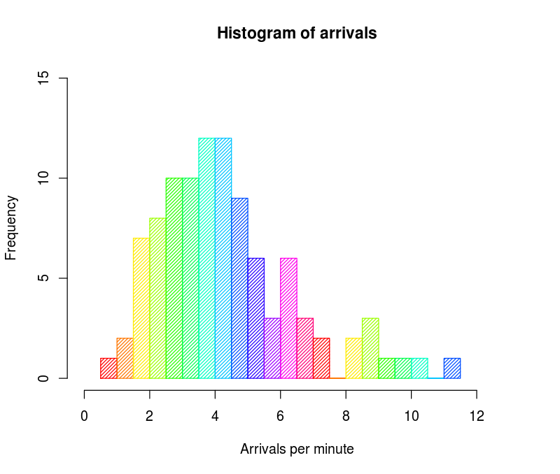
NOTE: the intervals in the chart are different from the ones we used in the example, but it is still what your average histogram may look like.

If one of the sides is much higher or lower than expected in the normal bell-shaped curve, you can identify the production problem – that is, whether you are underestimating or overestimating the average cookie size, and more importantly, how frequently this problem occurs.

Why Histograms for Data Analysis?

Histograms are great because they don’t just point out the “deviations” or “outliers” in datasets, they also show the frequency of those deviations.

In other words, if your histogram is skewing to the right or the left when you have not set it up that way, that could mean that there is a surprise factor that is causing more deviations than normally expected.

Benefits of using histograms in manufacturing

The manufacturing industry often depends on the revelations from histogram charts. This is because large industrial plants often have many active elements at play and it is difficult to see exactly where suboptimal performance is occurring.

If a factory produces an immense volume of items with millimeter-precision measurements, it can be difficult to find areas which can be continuously improved.

A histogram chart can easily identify if there’s one machine among dozens that is error-prone or set up erroneously. This makes it an invaluable tool of quality when producing at scale.

A Histogram is NOT a Bar Chart

They may look similar, but histograms and bar charts are not the same in data analysis. The easiest way to remind yourself of this discrepancy is this:

  • A bar chart represents categorical variables for discretely measured things
  • A histogram represents continuous data, or the frequency (or density) of variables

A histogram does not necessarily have to have equally sized “buckets” that the data is sorted into. This, however, is a more complicated detail that is best understood by analytical software or a skilled data analyst.

Discover More

Share The Knowledge

Blog

Read up on manufacturing trends and noteworthy industry news

Read The Latest

Solutions

Enhance your shop floor experience and gain instant benefits with our work instruction software solution.

Start Learning

Newsletter

Keep in touch with us and our expanding, up-to-date knowledge base